Pick up any asset management firm’s quarterly investor letter and it’s likely filled with charts, graphs, and other visual representations of the latest trends influencing financial markets and fund performance.
Whether it’s a simple line graph showing the CBOE Volatility Index or a scatterplot graph showing the dispersion of returns of various asset classes, these graphical elements can be a powerful way to make your thought leadership more visually engaging for readers.
The problem: The financial services industry is epidemically bad at presenting data in a way that is easy for readers to understand.
Perhaps the most common example of the problem is a quarterly investor letter with plenty of charts and graphs—but no explanation outside of the body of the text of what these charts and graphs mean.
What’s more, the charts and graphs included in financial communications are often busy and overly complex, with a flurry of overlapping lines, dots, and other perplexing visual elements that crowd the page, making it difficult to understand.
Because financial marketers are trying to convey information that is complex by nature, they may feel that they have no choice but to include visual elements that are clustered and hard-to-understand without reading the body of the letter closely.
Luckily, there are some simple principles financial marketers can use to fix this problem.
To this end, here are five things financial marketers should NOT do when conveying data graphically in their thought leadership.
Don’t include charts without headlines or captions
All too often visual elements in financial thought leadership are inserted into the body of an article, investor letter, or white paper without any headlines or captions explaining why the information is significant or what it means. More often than not, readers are going to scan the page before reading the body of the text, with their eyes immediately darting to the sleek visual elements you included to make the reader experience more enriching.
As a result, don’t assume readers are going to understand the data in the charts without context. Use creative headlines and captions to explain the visual element’s contents as if they stood on their own.
For examples of ways to do this well, look to newspapers like The Wall Street Journal or magazines like The Economist. Both publications do a great job of using headlines and captions to tell stories with their charts and graphs and other visual elements.
Here’s a simple example of how adding a headline and caption enhances the value of data. This is just a hypothetical example, but it’s easy to imagine seeing something like this in a quarterly investor letter from early 2018.
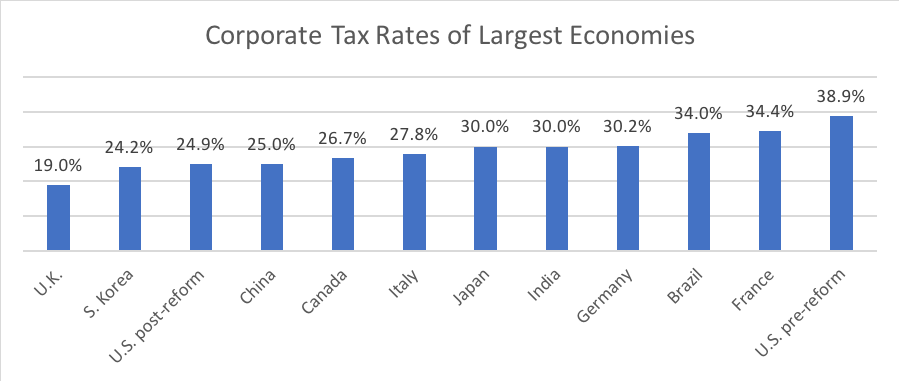
For the author, it probably seems obvious that readers should know to compare the U.S. corporate tax rate—both before and after tax reform—to other countries’ rates. But for someone quickly glancing at the chart, this might not be so intuitive. Also, many readers won’t read the full letter before glancing at this chart. In that case, the reader wouldn’t have any idea of what the lower rate means in terms of the bigger picture.
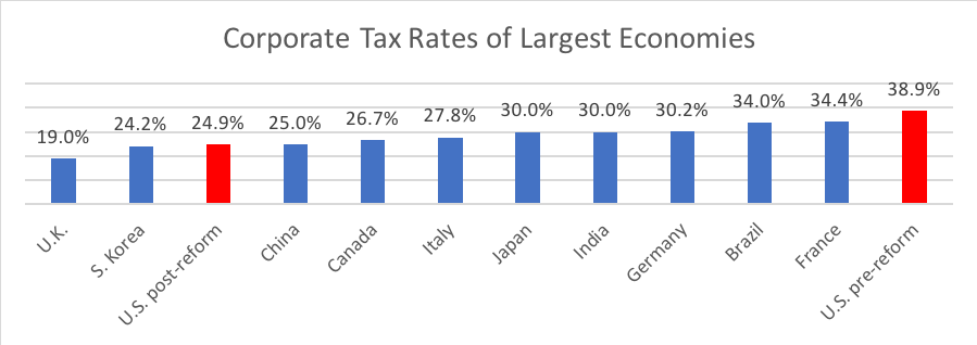
Let’s look at how adding a headline and caption can help alleviate these problems.
Tax Reform Reshuffles Tax Competitiveness Rankings
Before the Tax Cuts and Jobs Act, the United States had the highest statutory tax rate, which includes average state and local tax rates, of any developed country. Here’s how the United States stacks up among the 10 other largest countries in terms of GDP, before and after tax reform.
Don’t try to show too much on one graphic
Many charts and graphs that we see in financial industry thought leadership try to do too much. Remember, less is more.
Even though the data sets or trends you as a financial marketer are trying to convey are indeed complex, take the extra effort to distill the data down to the most important points that capture the crux of what you’re trying to convey to the reader.

At WFC, we like to use “the 5 second rule.” No, this isn’t a rule we use to determine if we can still eat something we accidentally dropped on the floor. Instead, it’s a measure of how long a reader should need to look at a chart or graph and be able to understand it.
Simply put, if it takes longer than five seconds for a reader to understand what’s happening in a visual data element, it needs to be simplified further.
Don’t overuse infographics
Marketers in 2018 love—I mean love—infographics. Hardly a minute goes by on someone’s Twitter feed without a splashy infographic popping with a deluge of data complemented by cartoony and colorful images.
The problem is most infographics try to cram in too much data. You look at them and it looks like a number-bomb went off on your screen. It’s hard to know what you’re supposed to be focusing in on.
Again, less is more. Don’t try to use infographics to show everything that you know about a topic. Instead, pick three or four of the most important or interesting data points to feature. This will make it a whole lot easier for readers to understand.
Don’t use animation for the sake of animation
The popularity of video and motion graphics are driving many financial marketers to look for creative ways to integrate these tools into their thought leadership. While these tools can add an impressive visual splash to your thought leadership, don’t fall into the trap that every chart or graph will automatically be enhanced by making it animated.
Sometimes the animation can distract the reader from the main idea, and too much animation can be overwhelming for readers. Don’t make the visual presentation of data more complicated than it needs to be. If a simple bar chart will do, leave the animated motion graphics for something where the movement helps the reader understand the dynamics underlying the data.
Don’t try and overwhelm the reader with every data point you can find
Just because you have access to a data set that’s related to your topic that doesn’t mean it should be included in your thought leadership. Instead of trying to boil the ocean by including all seemingly relevant data on a particular topic, pick 2-4 of the most important ones and feature them prominently. The “less is more” rule applies to most things in content marketing, including how much data to visually present in your article, white paper, or investor letter.
About the Author

Frank Kalman is the chief operations officer at Wentworth Financial Communications. Frank and the team of writers and editors at WFC help professionals across the financial services industry build their brands by creating investment-grade white papers, bylined articles, newsletters, blogs, social media posts, and other forms of content marketing.