Appearances Matter: 6 Ways to Make Your Financial Content More Scannable and Attractive
No matter what anyone tells you, appearances matter. This is true about dating, and it is true about writing financial thought leadership. Let me explain why.
Although I have been happily married to a wonderful woman for more than six years, I can remember what it was like to get ready for a first date. I would carefully pick out an outfit that showed I was trendy without appearing to be trying too hard. I would make sure that I had gotten a haircut recently, and I would get a clean shave. (I could never pull off the five o’clock shadow.)
I knew that personal chemistry and values alignment were by far the most important things for a successful relationship, but I also realized that my physical appearance played an important role in sending the right message. My date would likely immediately start forming conclusions about me based on that first impression.
This same dynamic is at work when it comes to your thought leadership and other financial content marketing.
As a writer, I would like to think that the substance of my arguments and the compelling nature of the supporting details are all that matter. But the way these words and ideas show up on the page or screen are every bit as important.
Content needs to be visually appealing and easy to scan. This “scannability” factor has always been important, but it is especially so in today’s digital age, when readers are constantly bombarded with information and forced to make quick decisions about whether your white paper, blog post or article is worth the investment of their time.
Fortunately, there are several techniques that anyone with a basic knowledge of Microsoft Word or PowerPoint can use to make it easy for readers to quickly grasp and digest the most valuable points of your content.
Simple Tactics for Enhancing Scannability
Here are six of my favorite techniques that financial marketers can use to enhance the scannability of their content and ensure that their thought leadership makes a great first impression.
Key Takeaways: Tell Them What You’re Going to Tell Them
Many investment banks, asset managers, accounting firms and other financial services providers have started putting a handful of bullet points with key takeaways at the beginning of their articles. Bank of America’s case study of the work that its Global Banking & Markets group has done for Allstate is just one example.
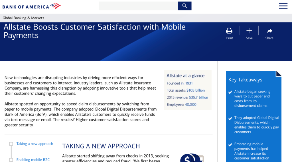
Some marketers may worry that including the key takeaways at the beginning of a piece decreases the chance that people will read the whole article. I disagree. I think that these sections highlight the valuable and actionable insights embedded in the content and show readers what they will learn if they invest their time in the full article.
Descriptive Section Headers: Don’t Just List the Topic
Section headers provide a roadmap for readers and help break up the copy. But they should do more than simply list the topic that will be covered in the ensuing section. They should serve as a mini-headline for the section and provide a clue or create a sense of intrigue about what information is to come.
In a positioning paper WFC wrote for William Blair Investment Management, we used a variety of section headers to help keep readers engaged and informed. For example, instead of a simple header like “Our Fundamental Value Investment Process,” we wrote “Navigating Waves on the Journey to Fundamental Value”. The goal is to keep the reader interested and to maximize their enjoyment of the piece. Your audience will appreciate the extra time you spend to develop more interesting section headers, and perhaps they will show their appreciation by investing additional time in your piece.
Sidebars: More than a Hideaway for Misfit Ideas
Sidebars work well for showcasing ideas relevant to the article but not essential to the main story arc. But sidebars also can draw attention to ideas or examples that you don’t want to get buried in the middle of the body copy.
Because sidebars are usually a different color and appear to be floating in the middle of the body copy, they will grab readers’ attention as they scan the article. Use this valuable real estate to highlight particularly compelling ideas or anecdotes.
Charts: Don’t Let the Numbers Speak for Themselves
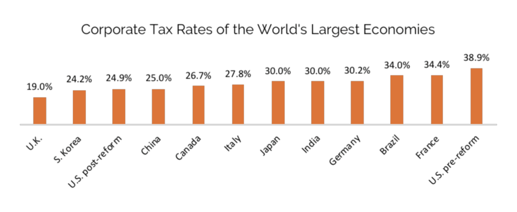
One of the most common sins of financial thought leadership is a chart that the author assumes is self-explanatory. More specifically, the author assumes that the key insights or trends revealed by the data will be self-evident.
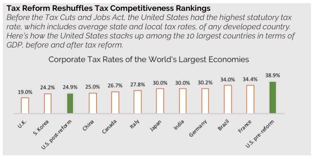
This is an example of the “curse of knowledge” taking over. The author is so close to the subject matter that he or she fails to appreciate that the reader doesn’t know what to look for within the chart. We created this chart below about corporate tax rates as an example. As you can see, readers are left to their own devices to sort through the numbers to find the story.
There are three primary ways to fix this, which we have applied to the chart below. First, create a headline for the chart that tells the high-level story of the data. Second, write a caption that provides context for the numbers and explains what you want readers to take from the data. Third, use simple design elements to draw the reader’s eye to the most important data points.
Callout Quotes: Be Terse. Be Provocative.
Callout quotes are one of the easiest ways to drive home a big idea while adding an element of visual interest to any piece of thought leadership. Rather than trying to find a quote that best summarizes the idea you want to reinforce, look for the quote that puts a fine point on a provocative aspect of that larger idea. The goal is to grab the reader’s attention and show that you have something interesting to say on the topic.
There are two types of callout quotes: ones that capture verbatim something said in the paper and ones that reflect an idea from the paper but aren’t necessarily a word-for-word replication. I recommend putting quotation marks around the former, but not the latter.
Direct quote:
“No matter what anyone tries to tell you, appearances matter. This is true about dating, and it is true about writing financial thought leadership.”
Summarized idea:
Whether you are getting ready for a first date or writing a piece of financial thought leadership, appearances matter.
White Space: Give Your Ideas Room to Breathe
Pages that are dense with text can be intimidating for readers. This design flaw also signals to readers that they must work hard to wade through all the information on the page. As a marketer, you want to lower the barrier to entry for your audience and invite them to dive in. That is why white space is so important.
Ways to give your ideas room to breathe on the page include:
- Using appropriately wide margins and line spacing
- Breaking longer paragraphs into shorter ones
- Turning a series of ideas into bullet points
Look Good. Feel Good. Write Good.
How your ideas show up on the page or screen matters—a lot. As part of a team of financial writers, I realize that our job isn’t just to craft ideas into sentences and paragraphs. Our job is to make these ideas compelling and easy to digest visually for the audience. That is why we care so much about appearances—and we think that all financial marketers and communicators should, too.
If you would like to chat about your own strategy for enhancing the scannability of your content, please contact us.
About the Author  Scott Wentworth is the CEO at Wentworth Financial Communications. He collaborates with a team of writers and editors at Wentworth to help professionals across the financial services industry build their brands by creating investment-grade white papers, bylined articles, newsletters, blogs, social media posts, and other forms of content marketing.